How to Increase Your YouTube CTR with Better Thumbnails
What Is a Good CTR on YouTube?
Click-through rate (CTR) measures the percentage of people who click your video after seeing the thumbnail. YouTube shows your CTR in Studio analytics, and most creators obsess over it for good reason — it directly affects how much YouTube recommends your content.
Here’s a rough benchmark:
- 2-4% — Average for most channels
- 4-7% — Good, your thumbnails are working
- 7-10% — Excellent, you’re doing something right
- 10%+ — Exceptional, usually on niche or loyal-audience channels
Don’t panic if your CTR is low. New videos often start with high CTR (your subscribers click quickly) then drop as YouTube shows them to broader audiences. A 5% CTR at 100K impressions is much harder to achieve than 15% at 1K impressions.
That said, improving your thumbnails is the single fastest way to boost CTR. Your title matters too, but the thumbnail is what people actually see first.
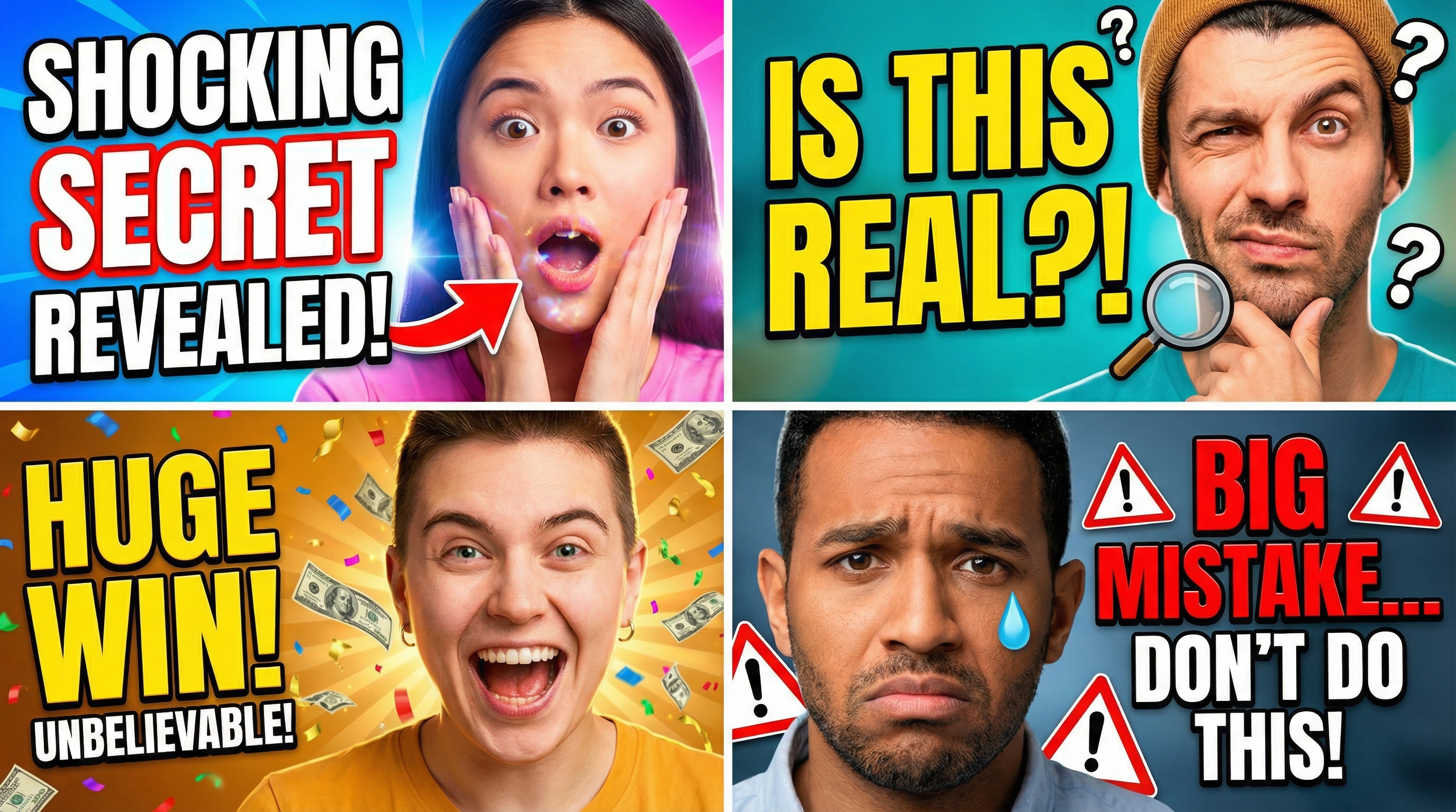
1. Use Faces with Exaggerated Expressions
Human faces draw attention. It’s wired into our brains — we can’t help but look at faces, especially ones showing strong emotion. The most-clicked thumbnails on YouTube almost always feature a person with an exaggerated expression: surprise, excitement, shock, curiosity, or even anger.
This doesn’t mean making the same fake-shocked face for every video. Match the expression to the content. A “10 things I wish I knew” video works with a thoughtful, slightly worried expression. A “I finally hit 1 million subscribers” video works with genuine excitement.
If you run a faceless channel, you can still use emotion through bold text, dramatic imagery, or visual contrast. But if you’re comfortable being on camera, showing your face in thumbnails is one of the easiest CTR wins.
2. Create Contrast Between Thumbnail and Title
Your thumbnail and title should work together but say different things. If your title says “I Built a $50K Home Office” your thumbnail shouldn’t have the text “$50K HOME OFFICE” — that’s redundant. Instead, show the stunning finished office with maybe just “BEFORE → AFTER” or no text at all.
The thumbnail creates curiosity. The title provides context. Together, they give the viewer a reason to click. If either one tells the whole story on its own, there’s less reason to watch.
Think of it like a movie poster: the image grabs attention, the tagline makes you want to know more.
3. Limit Text to 3-5 Words Maximum
Thumbnails display as small as 168 pixels wide in the suggested videos sidebar. At that size, more than a few words become unreadable mush. The most effective thumbnail text is:
- Short: 3-5 words absolute maximum
- Bold: Thick, high-contrast fonts (not thin or script fonts)
- Placed carefully: Not overlapping important visual elements
- Different from the title: Don’t repeat your video title
Some of the best-performing thumbnails on YouTube have zero text — just a compelling image. If you can communicate the video’s value with visuals alone, that’s often stronger than adding words.
When you do use text, make it punchy. “GONE WRONG” is more clickable than “Something Unexpected Happened During Our Trip.” Short text creates curiosity; long text kills it.
4. Use the Rule of Thirds (But Break It Intentionally)
Place your main subject off-center using the rule of thirds grid. This creates a more dynamic, professional-looking composition that naturally draws the eye. Most cameras and design tools can overlay a thirds grid to help you compose the shot.
But here’s the thing — centered compositions can also work incredibly well for thumbnails. A face staring directly at the camera, centered in the frame, creates an almost confrontational energy that’s hard to scroll past.
The key is being intentional. Don’t just slap elements wherever they fit. Decide where you want the viewer’s eye to go first, then compose around that.
5. Make Your Thumbnails Visually Distinct from Each Other
Go to your YouTube channel page and look at your last 12 thumbnails together. Do they look like a cohesive brand, or do they all look identical? There’s a critical difference.
Cohesive means consistent colors, fonts, and style — viewers recognize your content instantly. Identical means every thumbnail looks the same and viewers can’t tell which video is which.
The fix: maintain your brand elements (color palette, font choice, general style) but vary the composition, background color, and imagery for each video. Some channels alternate between 2-3 template styles to stay consistent without being repetitive.
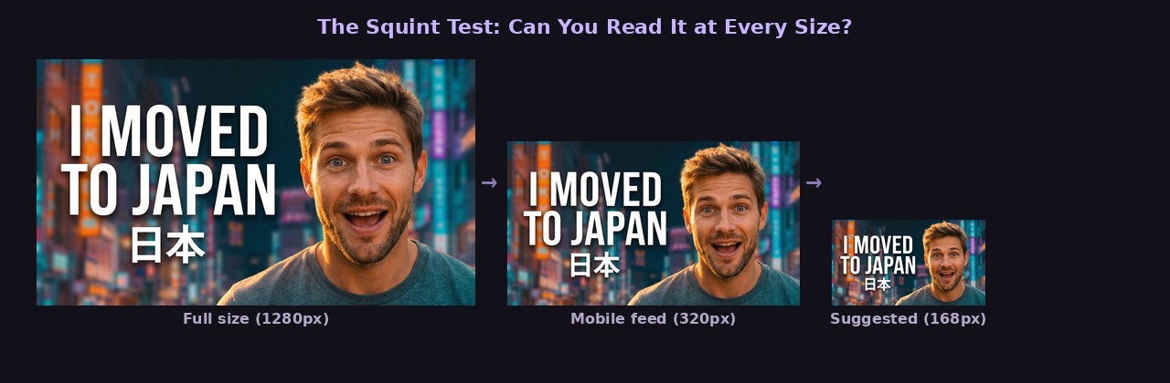
6. Test with the Squint Test
Shrink your thumbnail to the size it’ll actually display — roughly 320 pixels wide for mobile feeds. Then squint at it. Can you tell what it’s about? Can you read any text? Does anything stand out?
If your thumbnail passes the squint test, it’ll perform on YouTube. If it doesn’t, simplify. Remove elements until the core message is immediately clear at small sizes.
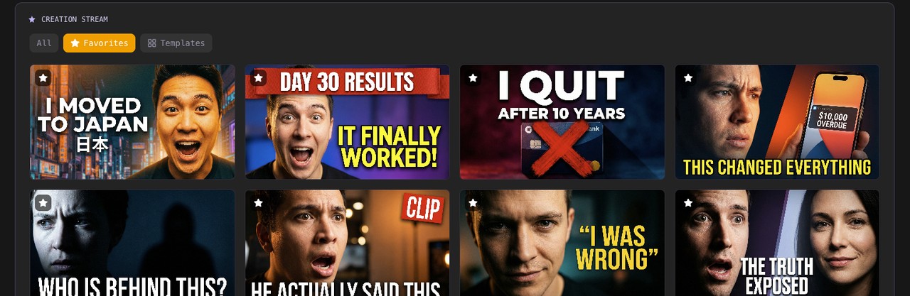
This is one area where AI thumbnail generators shine. With a tool like ThumbGen, you can quickly generate 4-8 variations of a thumbnail concept and compare them side-by-side. Instead of spending an hour perfecting one design, you spend five minutes choosing the strongest option from several AI-generated alternatives.
7. Study What’s Already Working (in Your Niche)
Search YouTube for keywords you want to rank for. Look at the thumbnails of the top 10 results. What patterns do you notice? What colors dominate? Do they use faces? Text? Before-and-after layouts?
These patterns exist because they work. You don’t need to copy them exactly, but understanding what’s already clicking with your target audience gives you a massive head start.
Pay special attention to the contrast between thumbnails in a search result. If every competing thumbnail is blue, making yours orange immediately makes it stand out. If everyone uses faces, a clean graphic or product shot might catch the eye precisely because it’s different.
8. Match the Thumbnail to Search Intent
When someone searches “how to change a tire,” they want clear, practical information. A thumbnail showing a tire being changed with a simple “STEP BY STEP” overlay matches that intent perfectly. An overly dramatic face or clickbait-style thumbnail would feel out of place.
When someone searches “you won’t believe what happened at this wedding,” they want entertainment and surprise. A dramatic thumbnail with expressive faces matches perfectly.
Match your thumbnail’s energy to what the viewer is actually looking for. Practical searches need practical thumbnails. Entertainment searches need emotionally engaging thumbnails.
9. Update Old Thumbnails That Aren’t Performing
YouTube lets you change thumbnails on existing videos anytime. This is one of the most underused growth strategies on the platform. Look at your analytics for videos with:
- High impressions but low CTR (people see it but don’t click)
- Good watch time but low views (the content is good, the packaging isn’t)
Create new thumbnails for these videos using everything you’ve learned. A fresh thumbnail can revive an old video’s performance, and YouTube often gives updated videos another round of recommendations.
This is where having a fast thumbnail workflow pays off. If updating a thumbnail takes you 45 minutes in Photoshop, you’ll only fix a few. If you can generate new options with ThumbGen in under a minute, you can systematically update your entire back catalog.
The Bottom Line
CTR improvement is a compounding advantage. A 1% increase in CTR means more clicks, which signals YouTube to show your video to more people, which means more impressions, which means even more clicks. Over time, better thumbnails don’t just improve individual videos — they accelerate your entire channel’s growth.
Start with the highest-impact changes: faces, minimal text, strong contrast, and matching search intent. Test variations, study your analytics, and keep iterating. The creators who treat thumbnails as a core skill — not an afterthought — are the ones who consistently grow.
Ready to Create Better Thumbnails?
Try ThumbGen free — generate stunning YouTube thumbnails with AI in seconds.
Get Started Free