12 YouTube Thumbnail Design Tips That Actually Drive Views
Why Thumbnail Design Matters More Than You Think
YouTube is a visual platform. Before anyone reads your title, watches your intro, or hears your content, they see your thumbnail. In the fraction of a second it takes to scroll past, your thumbnail either earns a click or gets ignored.
The difference between a 3% and a 7% click-through rate isn’t luck — it’s design. And you don’t need to be a professional designer to make thumbnails that work. These 12 tips are based on patterns from channels that consistently get millions of views.
1. Use High-Contrast Color Combinations
Thumbnails that pop use colors that contrast sharply with each other. The most effective combinations include:
- Yellow text on dark backgrounds — MrBeast uses this constantly, and it’s visible at any size
- White text with a dark stroke/outline — Readable on any background
- Complementary colors — Blue and orange, purple and yellow, red and cyan
- Bright subject on muted background — Naturally draws the eye to what matters
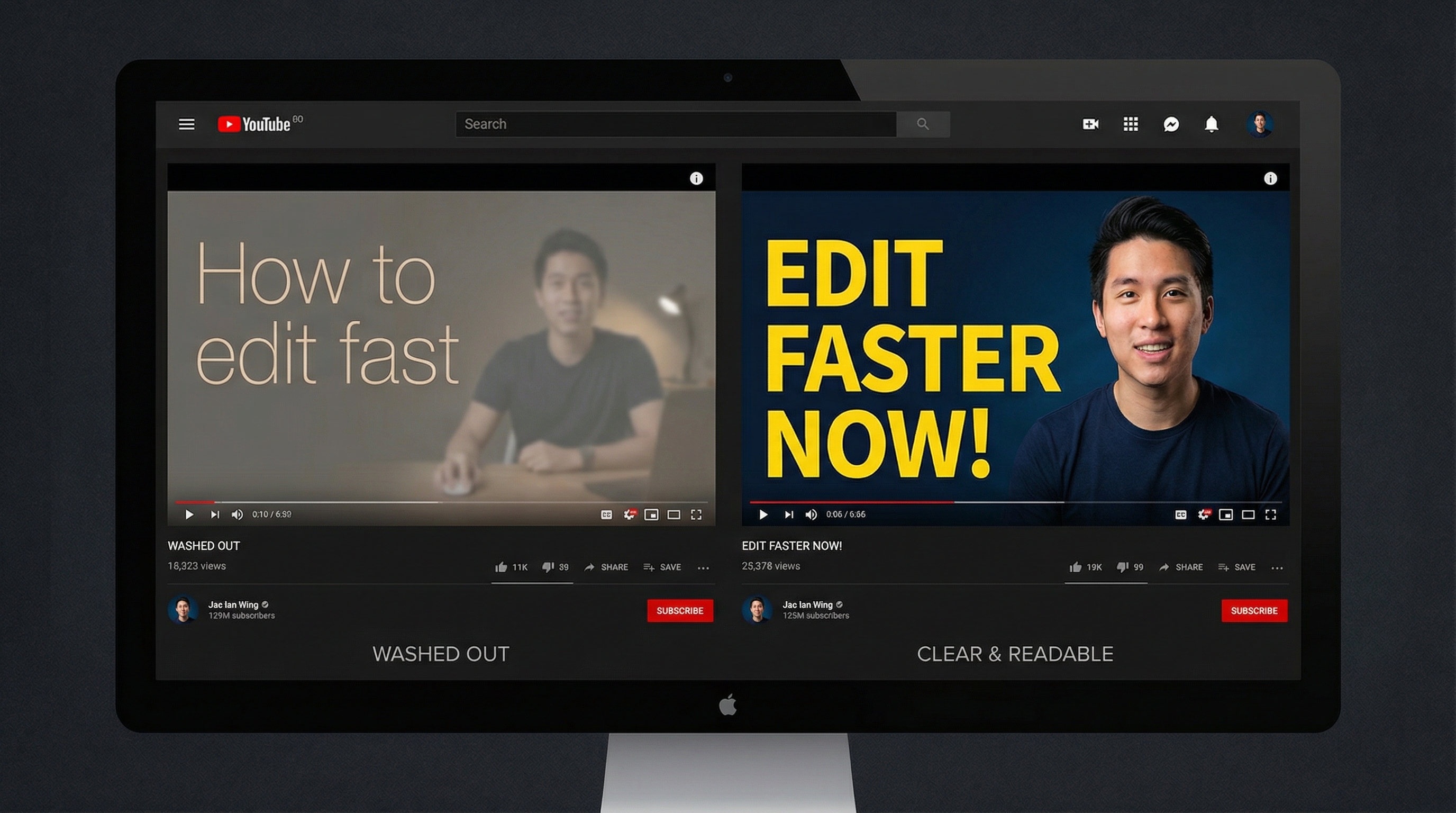
Avoid low-contrast combinations like light gray on white, or dark blue on black. If your thumbnail blends into YouTube’s white or dark interface, it won’t get noticed.
A practical test: convert your thumbnail to grayscale. If the important elements still stand out, your contrast is strong enough.
2. Choose Fonts That Read at 50 Pixels Tall
Most creators use fonts that are too thin or too decorative. At thumbnail scale, your text needs to be readable at roughly 50 pixels tall — the size it appears on mobile screens.
Fonts that work well for thumbnails:
- Impact — The classic YouTube thumbnail font for a reason
- Bebas Neue — Clean, tall, and modern
- Anton — Bold and condensed, fits more words in less space
- Montserrat Black — Professional with personality
- Any thick sans-serif — The pattern is clear: bold and simple wins
Fonts to avoid: thin weights, script/handwriting fonts, serif fonts at small sizes, and anything with fine details that disappear when scaled down.
Add a thick outline or drop shadow to text so it stays readable regardless of what’s behind it. A 3-4 pixel stroke in a contrasting color is usually enough.
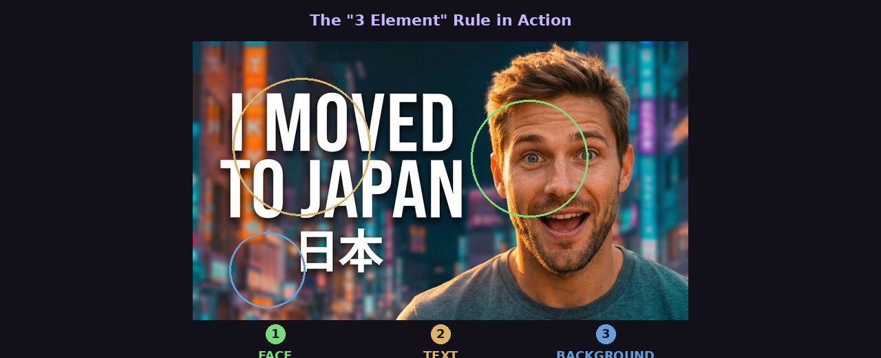
3. Follow the “3 Element” Rule
The best thumbnails have exactly three focal elements. More than three creates clutter. Fewer than two can feel empty.
Common three-element combinations:
- Face + text + object (person reacting to something)
- Before + arrow + after (transformation content)
- Number + subject + reaction (list/ranking content)
- Product + text + background graphic (review content)
Look at any successful YouTube channel’s thumbnails and count the elements. You’ll almost always find two or three. This constraint forces clarity — if you can only have three things, each one has to earn its place.
4. Use the “Z-Pattern” for Eye Flow
People scan images in a Z-pattern: top-left → top-right → bottom-left → bottom-right. Use this to guide where the viewer looks:
- Top-left: Your most attention-grabbing element (face, bold text)
- Middle: Secondary context (object, scene)
- Bottom-right: Call-to-action or payoff element
You don’t need to follow this rigidly, but understanding natural eye movement helps you place elements where they’ll actually be seen. Putting important text in the bottom-left corner, for example, is one of the last places the eye goes.
5. Create Depth with Layering
Flat thumbnails look amateur. Professional thumbnails create depth by layering elements at different visual depths:
- Background: Blurred or muted scene, gradient, or solid color
- Midground: Main subject or context
- Foreground: Text, borders, overlay graphics
This layering creates visual depth that makes the thumbnail feel polished without requiring advanced design skills. Even a simple blur on the background while keeping the subject sharp creates professional-looking depth.
When using ThumbGen, you can describe this layering in your prompt — for example, “blurred city background with a YouTuber in the foreground” — and the AI handles the composition for you.
6. Design for the Platform, Not for Print
Thumbnails aren’t posters. They’re tiny, quick-glance images competing with dozens of others for attention. Design decisions that work in print fail completely at thumbnail scale:
- Negative space — Useful in graphic design, wasted in thumbnails. Fill the frame.
- Subtle gradients — Disappear at small sizes. Use bold, flat colors instead.
- Fine details — Nobody sees them. Focus on one or two large, clear elements.
- Complex compositions — Can’t be parsed in a fraction of a second. Simplify.
Before finalizing any thumbnail, preview it at the actual sizes YouTube displays: roughly 320x180 pixels for mobile and 168x94 for suggested videos. If it doesn’t read at those sizes, redesign.
7. Use Arrows, Circles, and Visual Cues
YouTube viewers have been trained to follow visual cues. Arrows pointing to something interesting, red circles highlighting a detail, or zoom-in boxes showing a closer look — these visual elements work because they create curiosity.
Use them when:
- There’s a specific detail the viewer should notice
- You want to direct attention to one part of a complex image
- The interesting element is small and might be missed
Don’t overuse them. If every thumbnail has a red circle and three arrows, the technique loses its power. Save these cues for when they genuinely add clarity or curiosity.
8. Maintain Brand Consistency (Without Being Boring)
Viewers should be able to spot your thumbnails in their feed without reading the channel name. This comes from consistent brand elements:
- Color palette: Pick 2-3 signature colors and use them regularly
- Font: Use the same 1-2 fonts across all thumbnails
- Layout patterns: Develop 2-3 templates you rotate between
- Your face/logo: Same positioning in most thumbnails
The mistake is making every thumbnail look identical. If your last 10 thumbnails all have the same layout with different text, they blur together and viewers can’t distinguish between videos. Vary the composition and imagery while keeping the brand elements consistent.
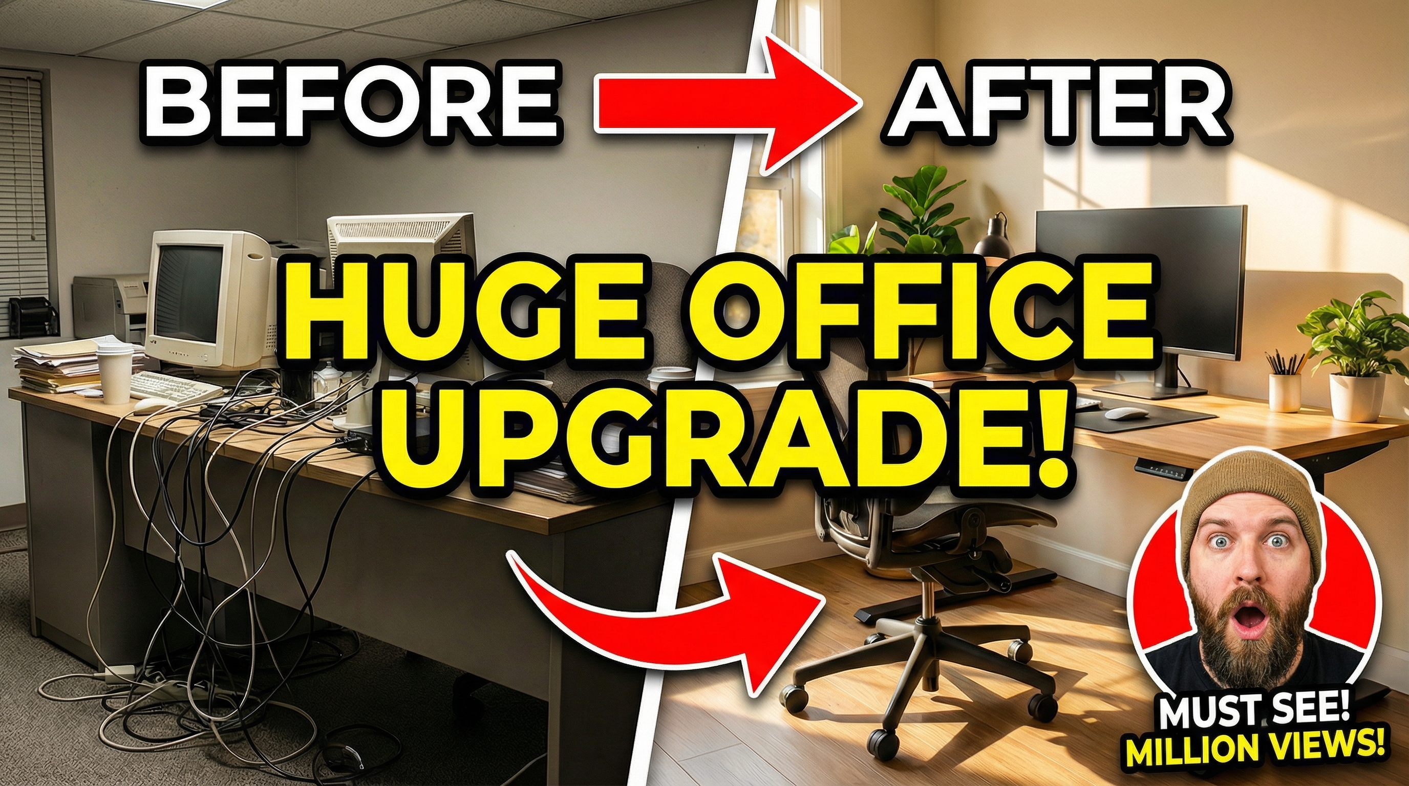
9. Use Before/After and Comparison Layouts
Split-screen layouts are incredibly effective for certain content types because they promise transformation or conflict — both are psychologically compelling.
Effective split layouts:
- Before/After — Weight loss, room makeovers, skill progression
- vs. — Product comparisons, $1 vs $1000, beginner vs pro
- Expectation/Reality — Humor-based content
- Old/New — Channel updates, technology evolution
The key is making the two sides visually different enough to create contrast. If both sides look similar, the split loses its impact. Exaggerate the differences — make the “before” look worse and the “after” look better than reality.
10. Color-Code Your Content Series
If you make different types of content (tutorials, vlogs, reviews, challenges), assign each type a distinct background color or visual style. This helps returning viewers find what they want and makes your channel page look organized and intentional.
For example:
- Tutorials → Blue backgrounds
- Reviews → Green backgrounds
- Challenges → Red/orange backgrounds
- Vlogs → Your signature color
This system also speeds up your thumbnail workflow. When you know “this is a tutorial, so it gets the blue template,” half the design decisions are already made.
11. Test Multiple Versions Before Publishing
Don’t commit to your first thumbnail idea. Create 3-4 variations with different:
- Text options (different wording for the same concept)
- Color schemes (warm vs cool, bright vs dark)
- Compositions (face on left vs right, text placement)
- Zoom levels (close-up face vs wider shot)
This is where AI tools provide a genuine advantage. With ThumbGen, you can generate multiple thumbnail variations in seconds by tweaking your prompt. Instead of spending an hour manually creating alternatives in Photoshop, you generate a batch and pick the winner.
YouTube also offers a built-in A/B testing feature for thumbnails called “Test & Compare.” Use it to let real viewer data — not your gut feeling — decide which thumbnail performs best.
12. Study Your Analytics, Not Just Other Channels
Your audience is unique. What works for MrBeast’s audience might not work for yours. The best design feedback comes from your own YouTube Analytics:
- Impressions click-through rate — Your overall CTR for each video
- Traffic sources — CTR varies by source (browse, search, suggested)
- Audience retention — If CTR is high but retention is low, your thumbnail might be misleading
Check which of your past videos had the highest CTR. What did those thumbnails have in common? That’s your channel’s winning formula. Do more of that, and gradually experiment with new approaches.
Putting It All Together
Great thumbnail design isn’t about mastering Photoshop or having a designer’s eye. It’s about understanding a few core principles — contrast, simplicity, emotional connection, and consistency — and applying them systematically.
Start with the tips that address your biggest weaknesses. If your thumbnails are cluttered, focus on the three-element rule. If they’re boring, work on contrast and color. If they’re inconsistent, develop a template system.
The creators who grow fastest treat thumbnails as a skill to develop, not a chore to get through. Every thumbnail is a chance to learn what your audience responds to and refine your approach for the next one.
Ready to Create Better Thumbnails?
Try ThumbGen free — generate stunning YouTube thumbnails with AI in seconds.
Get Started Free